Creating a custom ProtonMail theme
ProtonMail is a secure email provider for anyone concerned with Google reading their emails. It’s e2e encrypted, which means that there’s no way, not even for ProtonMail themselves, to read your emails. The bonus point is that it supports custom css.
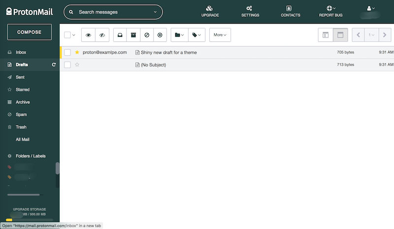
This is how ProtonMail looks like for me: •
How? •
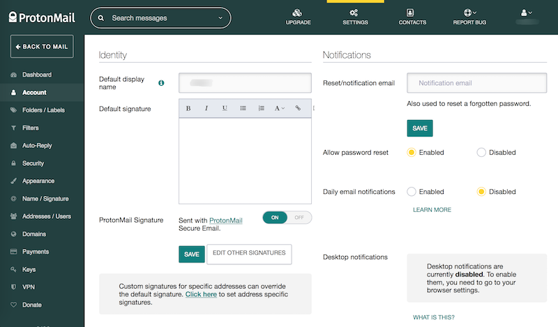
Just go to Settings → Appearance → Custom theme, and add your very own css.
It’s pretty straightforward: you check the css in the inspector, and change what you want to change. Without getting into it too much, this is what I did:
Let’s start with the basics:
/* body font */
body {
  font-family: 'Helvetica Neue', sans-serif;
}

/* main font colour */
#pm_main, #pm_main.rows {
  color: #222;
}
And set a base colour to our theme:
#pm_composer .composer header,
#pm_composer .composer footer .pm_button,
#pm_composer .composer footer .pm_button:hover,
#pm_composer .composer footer .pm_button.primary {
  background: white;
  color: #224040;
}

.headerDesktop-container,
.search-form-fieldset,
.searchForm-action-button-advanced:hover,
.searchForm-action-button-toggle:hover,
.headerDesktop-logo,
body section.sidebar {
  background: #224040;
}

.pm_buttons,
.pm_buttons a {
  color: #224040;
}
Shrink the conversation panel, lighten the colours, and add some more space after icons:
body #conversation-list-rows .conversation {
  height: 30px;
  line-height: 30px;
  border-bottom: 1px solid #d4d4d6;
  background: white;
  font-size: 13px;
}

body #conversation-list-rows .conversation.read {
  background: #f2f3f4;
}

body #conversation-list-rows .conversation .subject h4 .fa-mail-forward,
body #conversation-list-rows .conversation .subject h4 .fa-mail-reply,
body #conversation-list-rows .conversation .subject h4 .fa-mail-reply-all,
body #conversation-list-rows .conversation .subject h4 .folderConversations-container .fa {
  margin-right: 4px;
}
Change that accent from purple to gold:
body #conversation-list-rows .conversation .fa-star {
  color: gold !important;
}

/* a real gold bar! */
.storageBar .storageBar-progress {
  background-color: gold;
}

/* radios & checkboxes */
.customCheckbox-input:checked+.customCheckbox-mask {
  background-color: gold;
  border: 1px solid gold;
}

.customRadio-input:checked+.customRadio-mask {
  box-shadow: inset 0 0 0 3px #fff, inset 0 0 0 10px gold;
  border-color: gold;
}

/* active nav highlight on top */
.navigation > li.active,
.navigation > li:hover {
  border-color: gold;
}

/* selected conversations */
.conversation.marked::before {
  background: gold;
  width: 5px;
}
Let’s make links and buttons teal:
p a,
#pm_settings .pm_tabs li a.pm_button,
#pm_settings .pm_tabs li a.pm_button:hover,
#pm_settings .pm_tabs li.active a.pm_button,
.pm_button.link,
.settingsDashboard-plans .freeColumn-free,
.totalRows-2-years-price,
.totalRows-monthly-price,
.totalRows-yearly-price,
.pm_table table th a,
.pm_table table th .fa,
.createLabel-button,
.dropdown-folder-create-button,
.dropdown-label-search .fa.dropdown-label-search-icon,
#conversation-view .message .message-contact-sender,
#conversation-view .message .toggleDetails,
.messageContacts-btn-compose,
.overviewSection-container .topUp-button,
html.protonmail .text-purple {
  color: teal !important;
}

.settingsDashboard-plans.free-active .freeColumn-container,
.settingsDashboard-plans.plus-active .plusColumn-container,
.settingsDashboard-plans.professional-active .professionalColumn-container,
.settingsDashboard-plans.visionary-active .visionaryColumn-container {
  border-color: teal;
  box-shadow: 0 0 8px teal, 0 0 0 2px teal;
}

.settingsDashboard-plans [class*=Column-container] .isCurrent {
  background: teal;
  box-shadow: 0 0 8px teal, 0 0 0 2px teal;
  border-bottom: 1px solid teal;
}

body .cg-notify-message.notification-success,
.pm_badge.success,
.pm_toggle.off .off,
.pm_toggle.on .on,
.pm_button.primary,
.pm_button.primary:active,
.pm_dropdown .navigationUser-logout {
  background-color: teal !important;
  color: white !important;
}

.pm_modal .modal-dialog {
  border: 5px solid teal;
}

.pm_modal .modal-dialog .close {
  background: teal;
}
Adjusting button sizes…
.sidebar-btn-compose,
.sidebar-btn-compose:active {
  color: #fff !important;
  background: transparent !important;
  border: 1px solid rgba(255,255,255,.8) !important;
  height: 30px;
  min-height: 30px;
  line-height: 30px;
}

.sidebar-btn-compose:hover {
  color: #fff !important;
  background: rgba(255,255,255,.1) !important;
  border: 1px solid white !important;
  box-shadow: inset 0 400px 400px rgba(0,0,0,0.1);
}

.pm_button.primary,
.pm_button.primary:active,
.pm_dropdown .navigationUser-logout {
  border: none;
  line-height: 30px;
  height: 30px;
}

.pm_button.primary:hover,
.pm_button.primary:focus {
  background: #046161;
}

.pm_dropdown .navigationUser-logout:hover {
  background-color: #046161 !important;
  display: flex;
  justify-content: center;
  line-height: 30px;
  height: 30px;
}
I’d like my info panels to be very, very light gray, like this:
.alert.alert-info,
#pm_settings .pm_tabs {
  background: #f3f3f3;
}
…and finally, some things should just be plain white.
body section.sidebar ul.menu li a .fa-repeat,
body section.sidebar ul.menu li a i.fa:hover,
body section.sidebar ul.menu li a:hover i.fa,
body section.sidebar div.labels ul li a:hover,
body section.sidebar ul.menu li.active a i.fa,
body section.sidebar ul.menu li.active a i.fa:hover {
  color: white !important;
  opacity: 1;
}

body section.sidebar ul.menu li a i.fa,
body section.sidebar ul.menu li a em,
body section.sidebar div.labels ul li a,
body section.sidebar div.footer div.link a,
body section.sidebar a.version,
body section.sidebar div.footer div.storage strong {
  color: white;
  opacity: 0.5;
}

[class*="searchForm-action-button-"],
.navigation-link:hover {
  color: white;
}

.search-form-fieldset {
  border: 1px solid white;
}
That’s it, let me know if you like it! 🐕